
When designing a site, the website color palette selection plays a crucial role in capturing the attention of your audience and conveying your brand’s message effectively. In this blog post, we will explore the essential steps to help you select the perfect color palette that aligns with your brand identity and enhances the overall user experience. Whether you’re revamping an existing website or starting from scratch, these expert tips will guide you in creating a visually stunning and harmonious online presence.
Understanding Color Psychology:
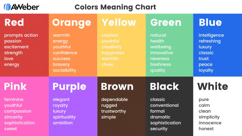
Colors evoke emotions and create associations. It’s important to consider the psychological impact of colors and how they align with your brand’s message. Here’s a great image from AWeber which shows the associations to each color. Check out their article here.
Defining Your Brand Identity:
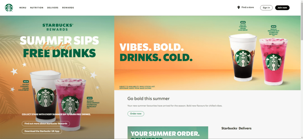
Your website color palette selection should reflect your brand’s personality, values, and target audience. Consider your brand’s core values, target demographic, and industry standards when choosing colors that align with your brand identity. Below you can see the site for Starbucks. As you can see they mostly use green, the main color associated with their brand, as well as black and white. As a brand they want to give off that Healthy, fresh vibe which they do with green all throughout their website.
Ready to create a visually appealing and engaging website with the perfect color scheme? Contact me today for a personalized quote or explore my services to see how I can assist you in bringing your vision to life.
Creating Visual Hierarchy:
Color can help guide users’ attention and create a clear visual hierarchy on your website. By strategically using contrasting colors, you can highlight important elements, such as call-to-action buttons, navigation menus, and key messages.
Ensuring Accessibility and Readability:
While aesthetics are important, it’s crucial to ensure that your color choices don’t compromise readability and accessibility. Consider color contrast, text legibility, and accessibility guidelines to make sure your website is usable for all users. Look back at that screenshot of Starbucks. You can see that they use colors which are on brand but also contrast well against each other. its important for your website color palette selection that you don’t sacrifice usability and accessibility for aesthetics.
Testing and Iteration:
Once you have selected a color scheme, it’s essential to test it across various devices and screen sizes to ensure consistency and optimal user experience. Gather feedback, iterate, and make adjustments as needed to achieve the desired impact.
Conclusion:
Choosing the right color scheme for your website is a critical aspect of successful web design. By understanding color psychology, defining your brand identity, creating visual hierarchy, ensuring accessibility, and conducting thorough testing, you can create a visually stunning website that resonates with your audience. Don’t underestimate the power of colors – let’s work together to create a website that captivates and drives results.